In what ways does your media product use, develop or challenge forms and conventions of real media products?
Wednesday, 29 April 2015
Evaluation - Question 1 - Film Magazine Front Cover
In what ways does your media product use, develop or challenge forms and conventions of real media products?


Film Magazine InDesign Draft: 2

This is my improved draft including the corrections suggested in my feedback. I have also added a variety of further conventional features to my media product at this stage. These aspects allow my media product to be successfully conventional as a result.
Film Magazine InDesign Draft:1

This is my initial draft of my film magazine front cover which advertises our film 'Cloven'. After receiving feedback from my teacher and my media class, I have decided to make a variety of changes in order to create an end product which is effectively conventional. My feedback stated that in order to create a media product which was of a higher quality, I must make the masthead of my magazine more enticing by changing the colour or style, as black is too basic and it isn't eye catching against various other colours present. I have decided to change the colour of my masthead to red and the background colour of my banner and footer line to black, seen as this colour position is more conventional. I was influenced by the Empire masthead when correcting its style and colour.
Monday, 20 April 2015

Film poster InDesign: Draft 2

This is my improved draft including the corrections suggested in my feedback. I have darkened the sky in my image a lot in comparison to my initial draft, I believe that this creates a more sinister feel which therefore relates to the genre effectively. I have also made my billing block much smaller which makes the texts appear less prominent, allowing my poster as a result to be mainly image led. I have added a blood splatter underneath the character's hand/on the tree to represent the disturbance of the film plot. I additionally decided to include my own personal improvements which was to increase the text size of the date release so that it is easily recognised. I did this as I believe that it is crucial for the audience to identify when the film is being released as it entices them to watch the film.
Film Poster InDesign Draft:1

This is my initial draft of my film poster which advertises our film 'Cloven'. After receiving feedback from my teacher and my media class, I have decided to make a variety of changes in order to create an end product which is effectively conventional. My feedback stated that in order to create a media product which was of a higher quality, I must make the sky in my image appear darker with a shadowed effect rather than having a white sky, as this is too pure for an evil scene which evidently doesn't relate to the horror genre. I must also add blood splatters to the character's hand so that it relates to the tag-line, "something was disturbed" this highlights the idea that this character is the cause of the disturbance; she has become physically and mentally insane. Based on my feedback, I have also decided to make the billing block on my film poster a lot smaller as my film poster appears to have too much text. This is a negative aspect to my page seen as posters are conventionally image led, making the billing block smaller will allow my image to be a lot more prominent. Lastly in order to represent the narrative of my groups film plot, I have decided to keep a highlighted border around the character's hair to represent the idea that she isn't completely evil, her soul is still there deep down and is not fully destroyed. The light surrounding her will create almost a halo effect which shows her vulnerability as she battles against this evil entity.
Sunday, 19 April 2015
Inspired makeup tutorials
This was the main 'possessed makeup tutorial' that inspired me to create my possessed makeup look the way I did. However I did make various changes and in my opinion improvements to my specific makeup routine such as the fact that I added a lot more red and purple to my eye makeup which appeared more realistic and unhealthy. Although I believe that her over all makeup look was effective as she was able to top of her possessed look by adding black contact lenses, which me and my group were unable to purchase. I decided not to add black colouring to my teeth as I believed it seemed too far fetched for an amateur production, I feared that it would appear laughable.
Friday, 17 April 2015
Makeup of charcters - Cloven
One of my main responsibilities whilst creating our film trailer, was to plan, design and to apply the theatrical media makeup on the characters present within our film trailer 'Cloven.' In order to make sure that this contribution was effective I had to carry out some research. I did this mainly from watching real existing horror films and trailers, so that I could pick up on what types of techniques were used. By carrying out research it also allowed me to identify what types of media makeup was typically used and I also recognised what wounds were often shown within horror films as a result. I also watched YouTube tutorials in order to gain practice and to obtain inspiration.
I tried to make the media makeup present within our trailer as realistic as possible, so that it appeared creepy enough for a horror film trailer. Although I had watched many horror films with far more advanced injuries, I tried to keep the makeup as basic and effective as possible, as I felt that over doing it would look amateur seen as I am not a professional makeup artist in special effects.
Possessed makeup look for the character Sam:


For this possessed look I tried to make myself look paler than I did before Sam channelled her possession within the film trailer. I did this to create the impression of her soul dying as it is taken over by this evil entity which is making her body suffer and start to deteriorate as a result. I wanted to make sure that Sam's eyes appeared to look tired, bruised and evil so that it was clearly identifiable that she was changing drastically as a person, mentally and physically. I also noticed that darkening the eyes was a conventional aspect to most possessed makeup routines as it symbolises the change the individual is going through. It represents the idea that the evil inside them is consuming their body and soul which is destroying their health as a result. I made my nostrils red to represent blood and to make Sam appear very ill. I believe that this would show that her insides are almost poisoned resulting in her bleeding from the inside out. I also made my lips appear pale to represent the idea that Sam no longer has any life left inside her, she looks drained of colour. Me and my group initially imagined this possessed makeup look to include black contact lenses, however we was unable to purchase a set due to costs and time restrictions. Over all I believe that this possessed makeup look is conventionally successful for our horror film trailer.
Beat up makeup look for the character Hayley:
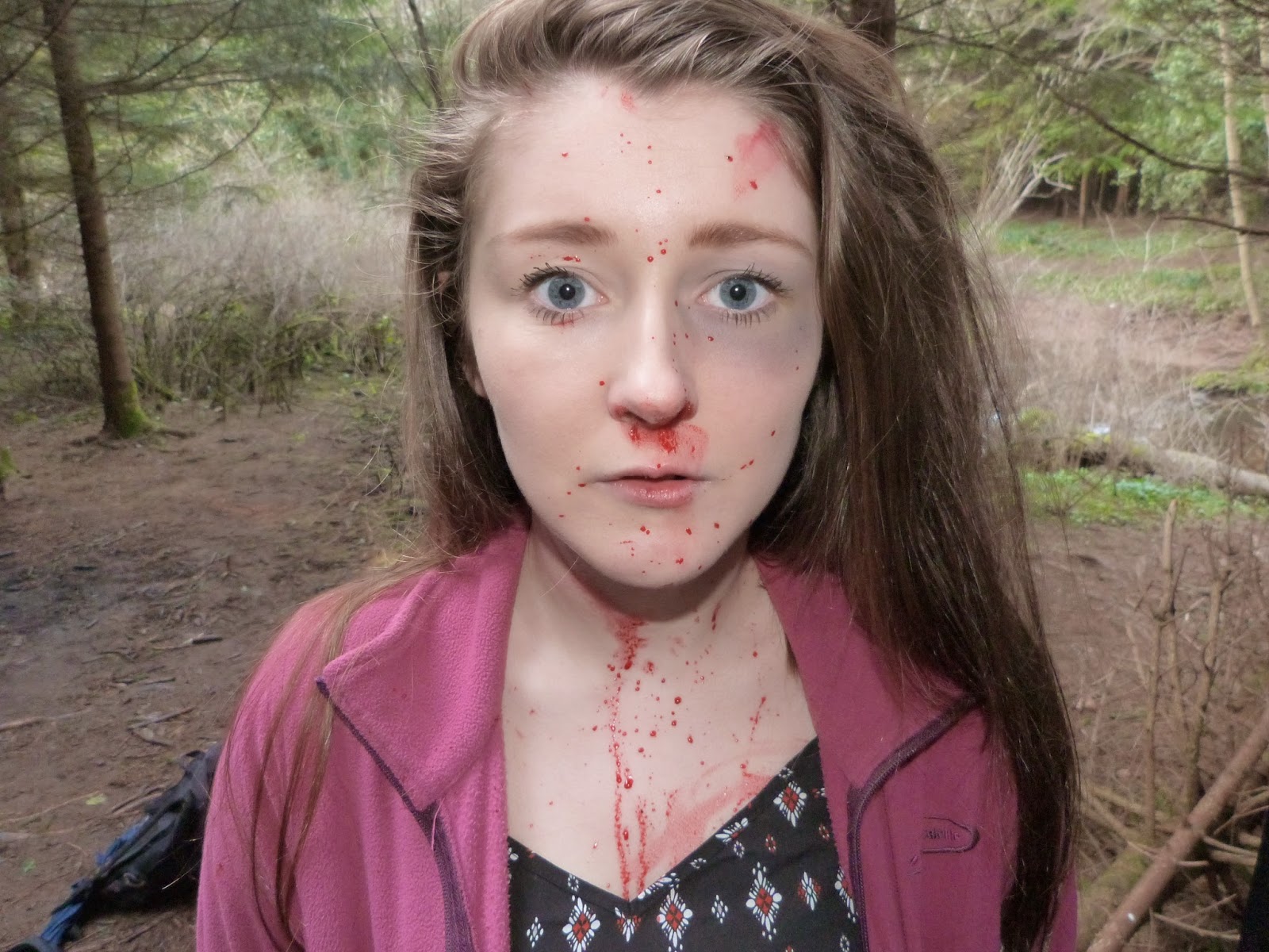

This specific makeup look shows the injuries sustained by the character Hayley when being attacked by Sam, whilst she had reached her strongest stage of her possession. I decided to keep Hayley's injuries basic so that it didn't look fake or ineffective. I decided to add bruising to her eyes seen as this is a sensitive part of the face which would realistically bruise within the time period. However I didn't make the bruising too dark as I wanted to represent fresh injuries rather than ones which had developed over time. I also decided to add blood around Hayley's nostril's because typically when an individual has experienced a strong force to their face they develop a nose bleed. Lastly to finish off Hayley's 'beat up look' I decided to add faint scratches on her neck and a blood splatter on her face to represent a high amount of physical pain and to suggest that maybe she has injuries in various other places on her body, hence the fact she has blood splatters. Also the blood creates a code of enigma as there is no apparent open wounds to suggest that it is her own blood. Over all I believe that this makeup look is effective for our horror film trailer as it evidently shows who the victim is.
Pre-dead makeup look for the character Marcus:

Before Marcus kills himself in our film plot he suffers a lot psychologically which makes him very ill and drives him insane. I attempted to show this through his makeup by making his face very pale so that he looks drained of colour representing the idea that he is unhealthy and weak. I also decided to add red circles, bags and bruising around his eyes to represent the idea that he has had a lack of sleep showing that he has evidently been tormented by something to drive him crazy. I believe that this specific makeup look over all is very successful, as it clearly reflects the psychological state that he is in.
Dead makeup look for the character Marcus:


Even though as a group we decided to remove the clip of Marcus killing himself on our film trailer, we still tested it out before we made our final decision whilst editing, so that we could see how successful it turned out. To represent Marcus' death I added a gun shot wound to his head as it is a typical form of suicide and matches the ideas within our film plot. I added the blood splatters to the characters face to make this makeup look seem more practical, as typically when an individual shoots themselves in the head the force causes the blood to spray in a particular way which doesn't tend to splatter in any specific direction. Even though in professional works of film this form of suicide would be far more advanced and realistic, I was unable to further my skills within these specific types of special affects seen as this is an amateur production. I also made sure that the character appeared pale so that it was evident that he was lifeless and the blood is therefore drained from his face as a result.
I tried to make the media makeup present within our trailer as realistic as possible, so that it appeared creepy enough for a horror film trailer. Although I had watched many horror films with far more advanced injuries, I tried to keep the makeup as basic and effective as possible, as I felt that over doing it would look amateur seen as I am not a professional makeup artist in special effects.
Possessed makeup look for the character Sam:
For this possessed look I tried to make myself look paler than I did before Sam channelled her possession within the film trailer. I did this to create the impression of her soul dying as it is taken over by this evil entity which is making her body suffer and start to deteriorate as a result. I wanted to make sure that Sam's eyes appeared to look tired, bruised and evil so that it was clearly identifiable that she was changing drastically as a person, mentally and physically. I also noticed that darkening the eyes was a conventional aspect to most possessed makeup routines as it symbolises the change the individual is going through. It represents the idea that the evil inside them is consuming their body and soul which is destroying their health as a result. I made my nostrils red to represent blood and to make Sam appear very ill. I believe that this would show that her insides are almost poisoned resulting in her bleeding from the inside out. I also made my lips appear pale to represent the idea that Sam no longer has any life left inside her, she looks drained of colour. Me and my group initially imagined this possessed makeup look to include black contact lenses, however we was unable to purchase a set due to costs and time restrictions. Over all I believe that this possessed makeup look is conventionally successful for our horror film trailer.
Beat up makeup look for the character Hayley:
This specific makeup look shows the injuries sustained by the character Hayley when being attacked by Sam, whilst she had reached her strongest stage of her possession. I decided to keep Hayley's injuries basic so that it didn't look fake or ineffective. I decided to add bruising to her eyes seen as this is a sensitive part of the face which would realistically bruise within the time period. However I didn't make the bruising too dark as I wanted to represent fresh injuries rather than ones which had developed over time. I also decided to add blood around Hayley's nostril's because typically when an individual has experienced a strong force to their face they develop a nose bleed. Lastly to finish off Hayley's 'beat up look' I decided to add faint scratches on her neck and a blood splatter on her face to represent a high amount of physical pain and to suggest that maybe she has injuries in various other places on her body, hence the fact she has blood splatters. Also the blood creates a code of enigma as there is no apparent open wounds to suggest that it is her own blood. Over all I believe that this makeup look is effective for our horror film trailer as it evidently shows who the victim is.
Pre-dead makeup look for the character Marcus:
Before Marcus kills himself in our film plot he suffers a lot psychologically which makes him very ill and drives him insane. I attempted to show this through his makeup by making his face very pale so that he looks drained of colour representing the idea that he is unhealthy and weak. I also decided to add red circles, bags and bruising around his eyes to represent the idea that he has had a lack of sleep showing that he has evidently been tormented by something to drive him crazy. I believe that this specific makeup look over all is very successful, as it clearly reflects the psychological state that he is in.
Dead makeup look for the character Marcus:
Even though as a group we decided to remove the clip of Marcus killing himself on our film trailer, we still tested it out before we made our final decision whilst editing, so that we could see how successful it turned out. To represent Marcus' death I added a gun shot wound to his head as it is a typical form of suicide and matches the ideas within our film plot. I added the blood splatters to the characters face to make this makeup look seem more practical, as typically when an individual shoots themselves in the head the force causes the blood to spray in a particular way which doesn't tend to splatter in any specific direction. Even though in professional works of film this form of suicide would be far more advanced and realistic, I was unable to further my skills within these specific types of special affects seen as this is an amateur production. I also made sure that the character appeared pale so that it was evident that he was lifeless and the blood is therefore drained from his face as a result.
Tuesday, 7 April 2015
Subscribe to:
Comments (Atom)